
Amazon Ads That Drive Profitable Growth 🏆
Home » Amazon Main Image CTR
Every other page in our Amazon Creatives and Designing services — Brand Guidelines, Brand Story, the Storefront, secondary Listing Images, A+ Content — depends on the main image doing its job first. Shoppers process an image in as little as 13 milliseconds; the main image is what they see before anything else in the search results, and it earns or loses the click before a single bullet point, A+ module, or Storefront page ever gets the chance to matter. This page covers the full discipline of main image optimization: compliance, differentiation, testing, and the CTR-to-rank flywheel that makes this the single highest-leverage creative asset on an Amazon listing.
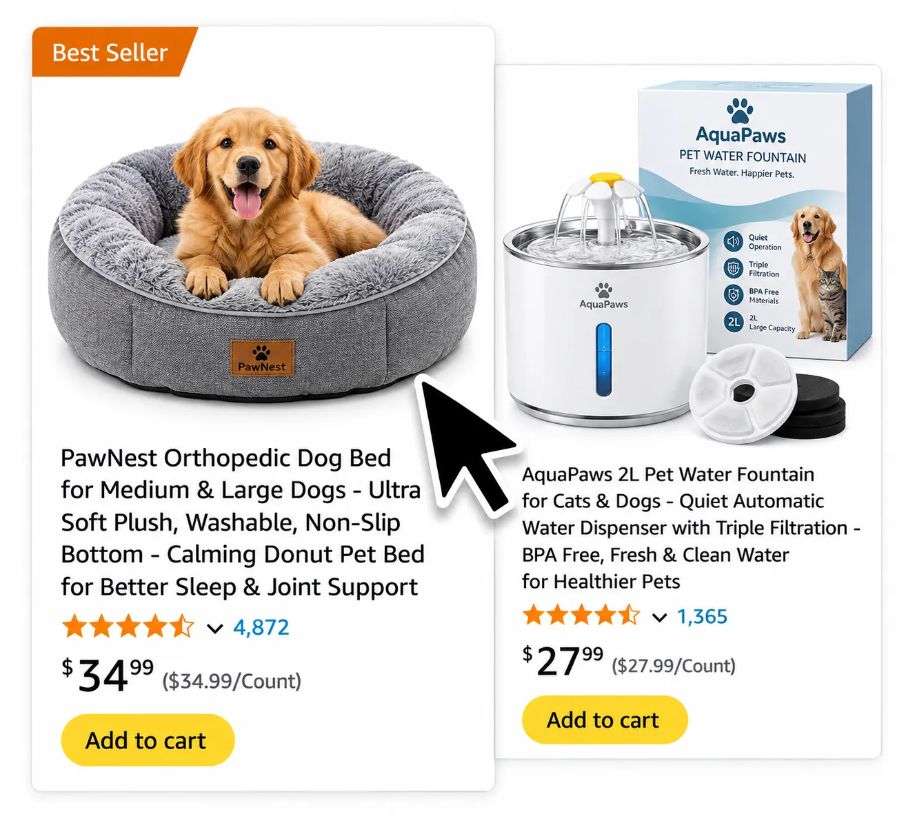
The main image drives click-through rate (CTR) from search results, sponsored ads, and category pages — and CTR feeds directly into Amazon’s ranking algorithm as a relevance signal. A stronger main image increases clicks, which increases sessions and sales velocity, both of which the algorithm reads as evidence the listing deserves better placement. This creates a compounding flywheel: CTR → sales → rank, where a genuinely better main image doesn’t just win more clicks today, it can improve organic position over time as those stronger signals accumulate.
Non-negotiable, and increasingly strictly enforced: a pure white background at exact RGB 255,255,255 (off-white, cream, or light grey can trigger suppression even though they look nearly identical to true white), the product filling at least 85% of the frame, no text, logos, badges, or props, and a minimum resolution of 1,000px on the longest side, with 2,000px or higher recommended to properly enable Amazon’s zoom feature. Format should be JPEG at 85–95% quality in sRGB color space. AI-generated or AI-modified main images are not permitted under current policy — the main image must be a genuine photograph (or compliant 3D render) of the actual physical product.
Before publishing any new main image, run it through a structured check rather than relying on subjective judgment:
Flash the image for one second; can a viewer immediately identify what it is?
Shrink the image to the size it actually renders in search results; is it still clear and compelling?
Does the product genuinely dominate the frame, or does it read as small and lost in white space?
At full resolution, can a shopper zoom in on fine detail without visible pixelation?
Placed next to the top three category-leading listings, does it stand out or blend in?
Pure white background, zero text overlays, zero props, correct resolution and format.
Start by auditing the top 10–15 listings for the primary target keyword and laying their thumbnails side by side — the goal is identifying the visual pattern everyone in the category follows, because that pattern is exactly what’s worth breaking. If every competitor shows a straight front view, a 45-degree angle stands out. If every competitor uses a light, muted color palette, genuine color contrast against the white background can pull meaningfully higher CTR in a crowded, visually similar search grid. The constraint throughout: differentiation has to still read as a clear, professional product photo at thumbnail size — anything that looks gimmicky or overly busy at small size hurts CTR even if it looks creative at full resolution. The goal isn’t being different for its own sake; it’s being instantly understood and instantly preferred.
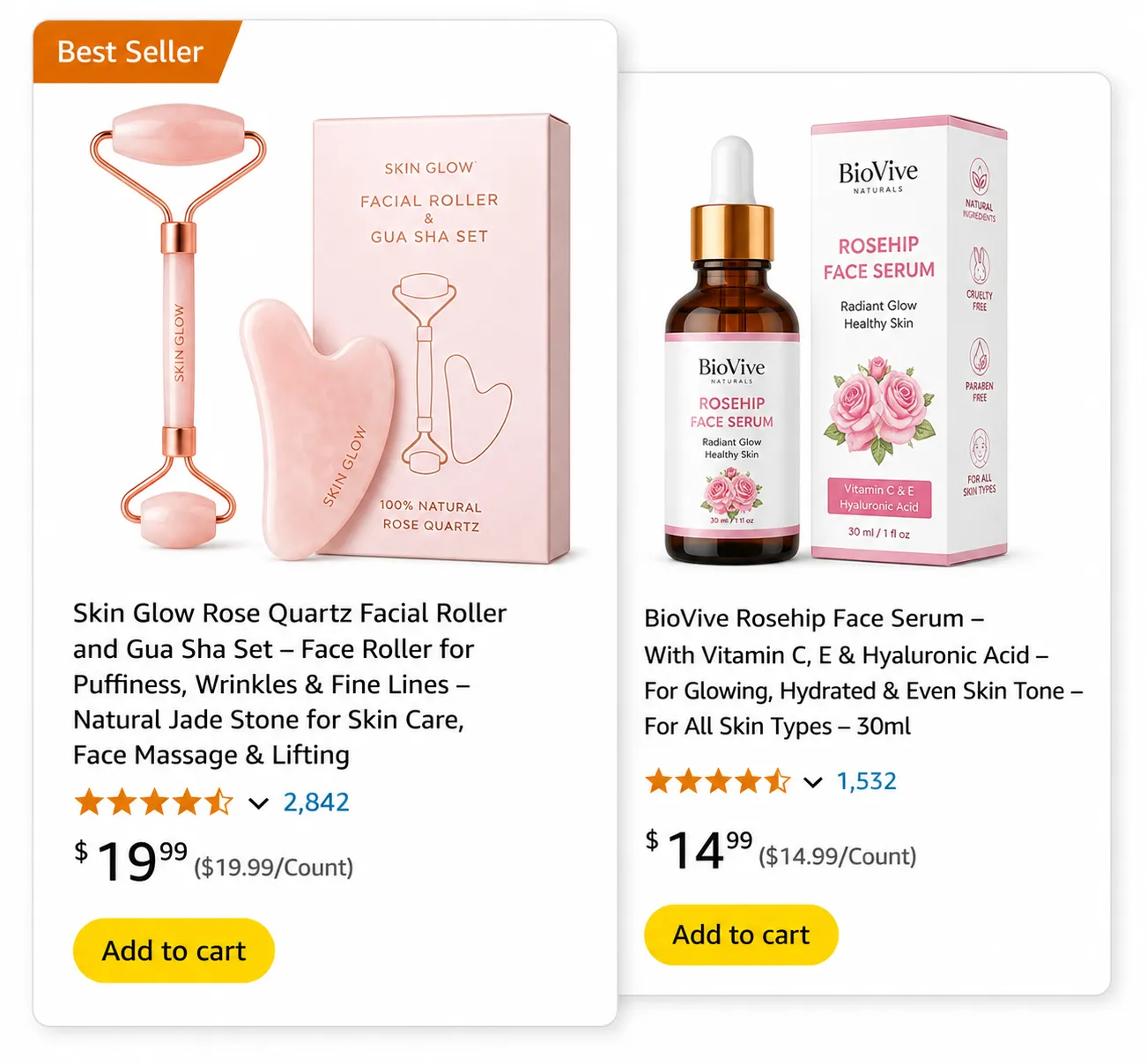
Before investing in a redesign, confirm the main image is actually the bottleneck: compare sessions relative to ad spend against Unit Session Percentage. If sessions are low given the traffic being driven to the listing, the main image is the likely culprit — a CTR problem. If sessions are healthy but conversion is weak once shoppers land on the page, the issue more likely sits with the secondary image sequence, A+ Content, or listing content covered on our other creative pages, not the main image itself. This diagnostic step prevents spending a redesign budget on the wrong part of the funnel.

Never guess at main image performance — test it, with a real methodology rather than a one-off swap.
Build two to three genuinely different concepts — a different angle, a different framing, a different lead detail — not three minor variations of the same underlying idea. Minor tweaks rarely produce a clear enough signal to justify a testing cycle; genuinely distinct concepts are what generate a meaningful result.
Brand Registered sellers can use Amazon's native Manage Your Experiments tool, which splits real search traffic between image versions and tracks impressions, clicks, and sales for each automatically. Without Brand Registry access, a controlled PPC-driven split test — running comparable ad campaigns with different main images and comparing CTR — is the practical alternative, though it offers less clean data than Amazon's native tool.
Run any test for a minimum of two to four weeks, with 30+ days recommended for full statistical confidence — shorter windows risk mistaking normal day-to-day variance for a genuine performance difference. Isolate CTR specifically as the metric being judged; conversion rate matters too, but it's downstream of price, reviews, and other factors the main image doesn't control, so CTR is what actually tells you whether the image itself is doing its job.
Before a shopper reads your title or checks your price, they’ve already judged your main image. We optimize it against category benchmarks, Amazon’s compliance guidelines, and proven CTR drivers — clarity at thumbnail size, product framing, and visual differentiation from competitors — so your listing earns the click instead of getting scrolled past.
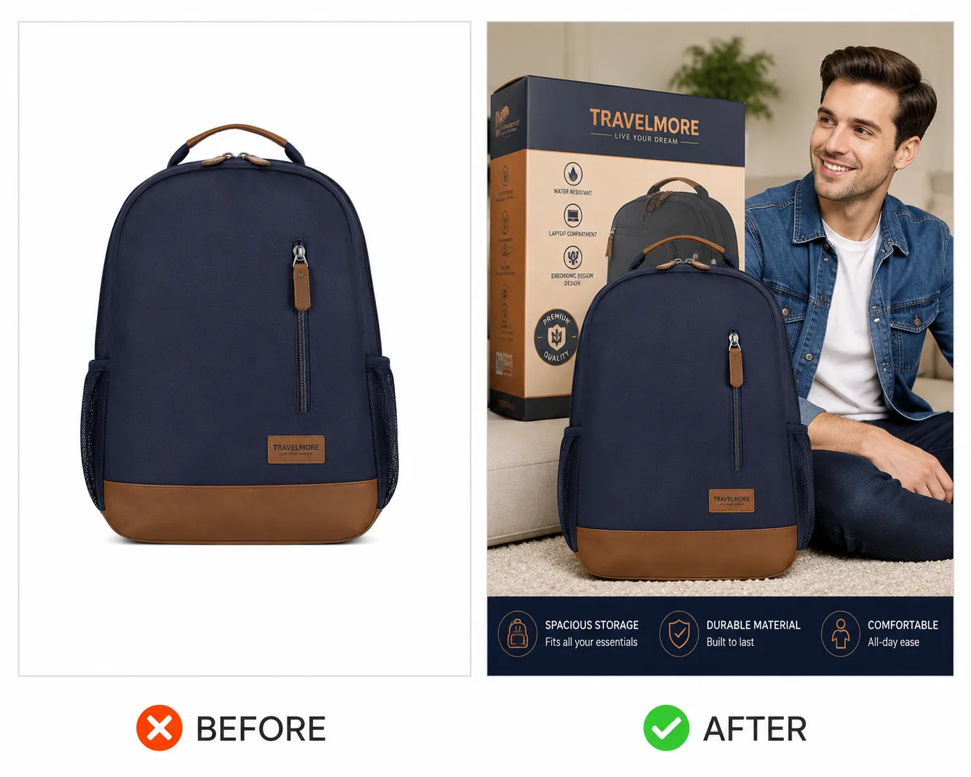
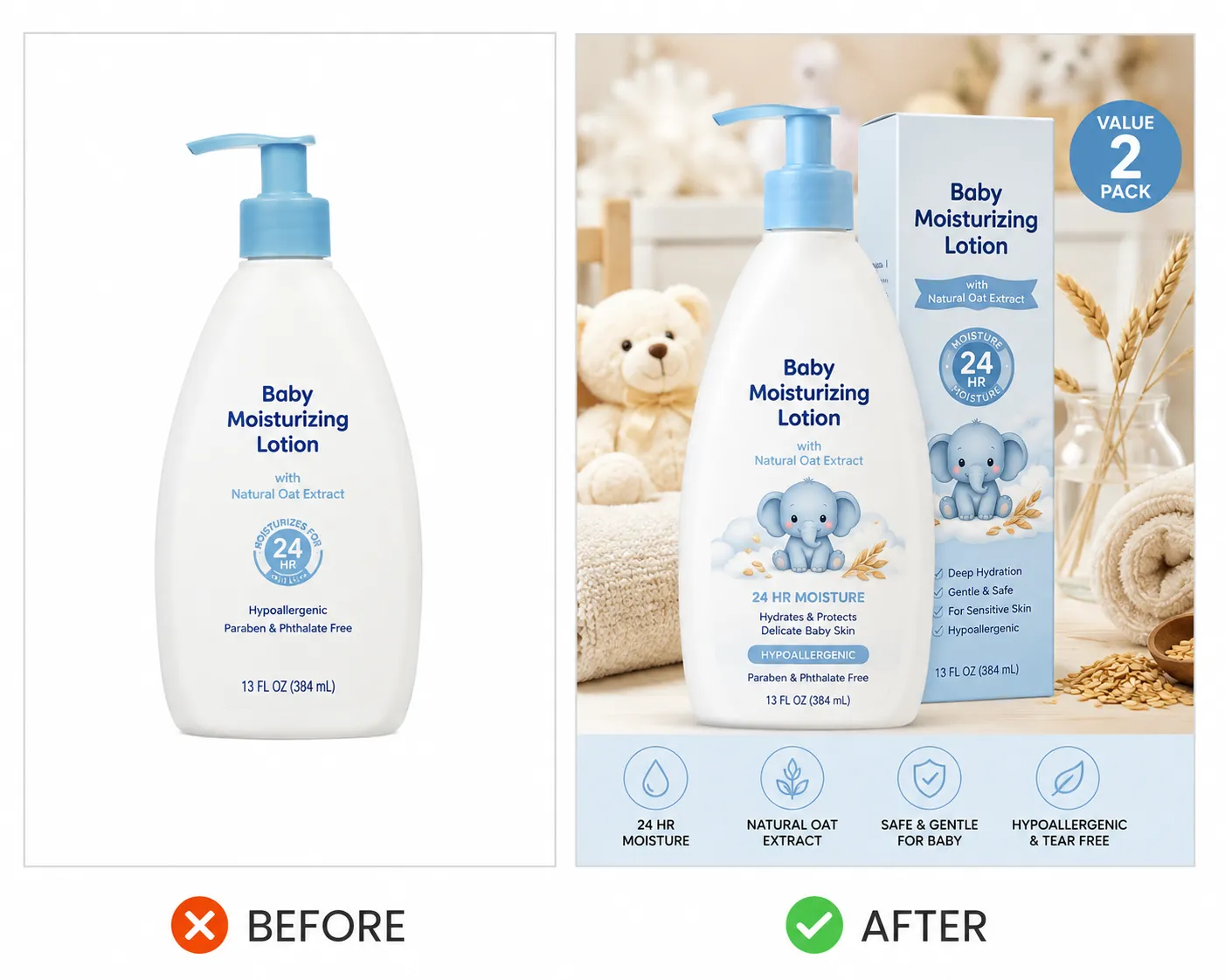
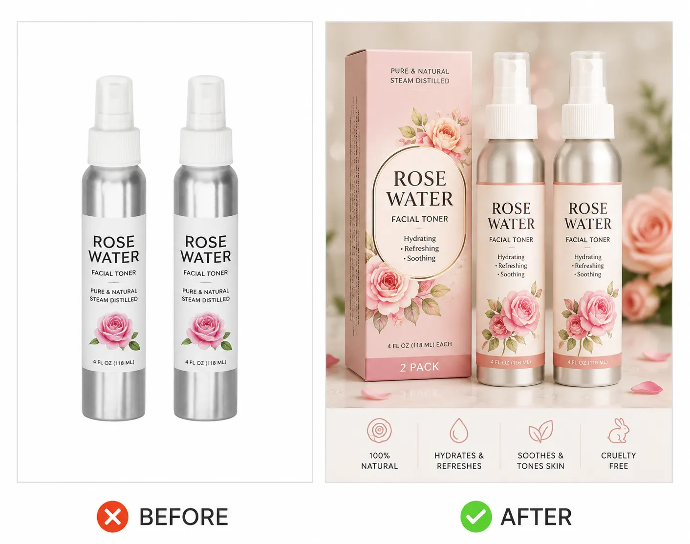
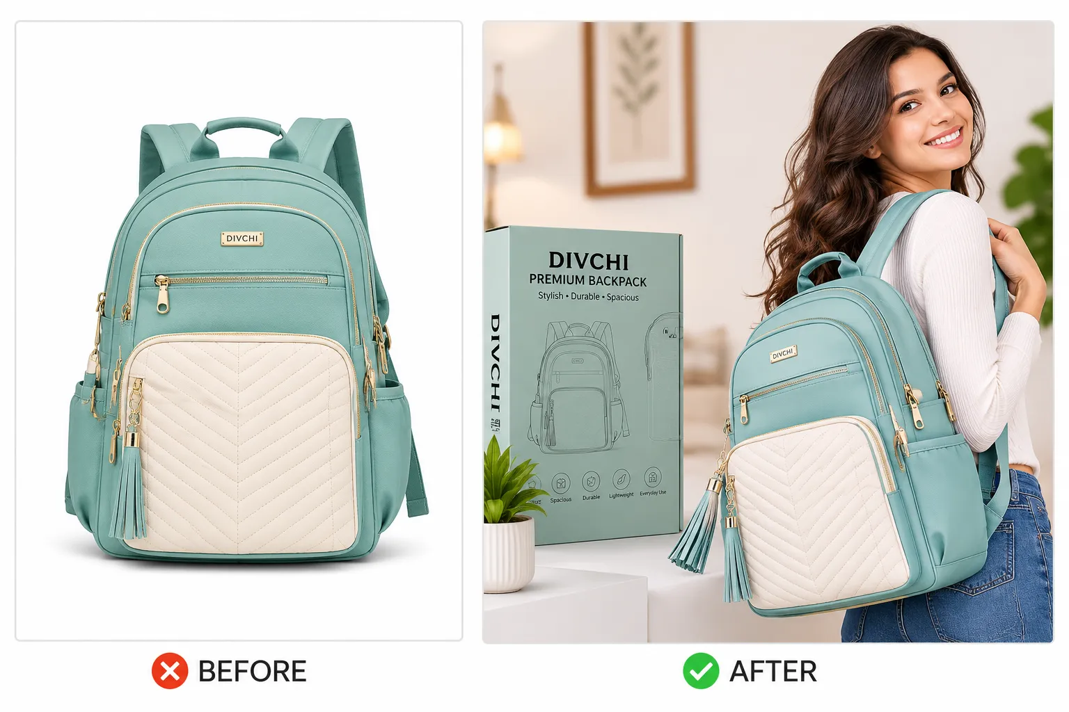
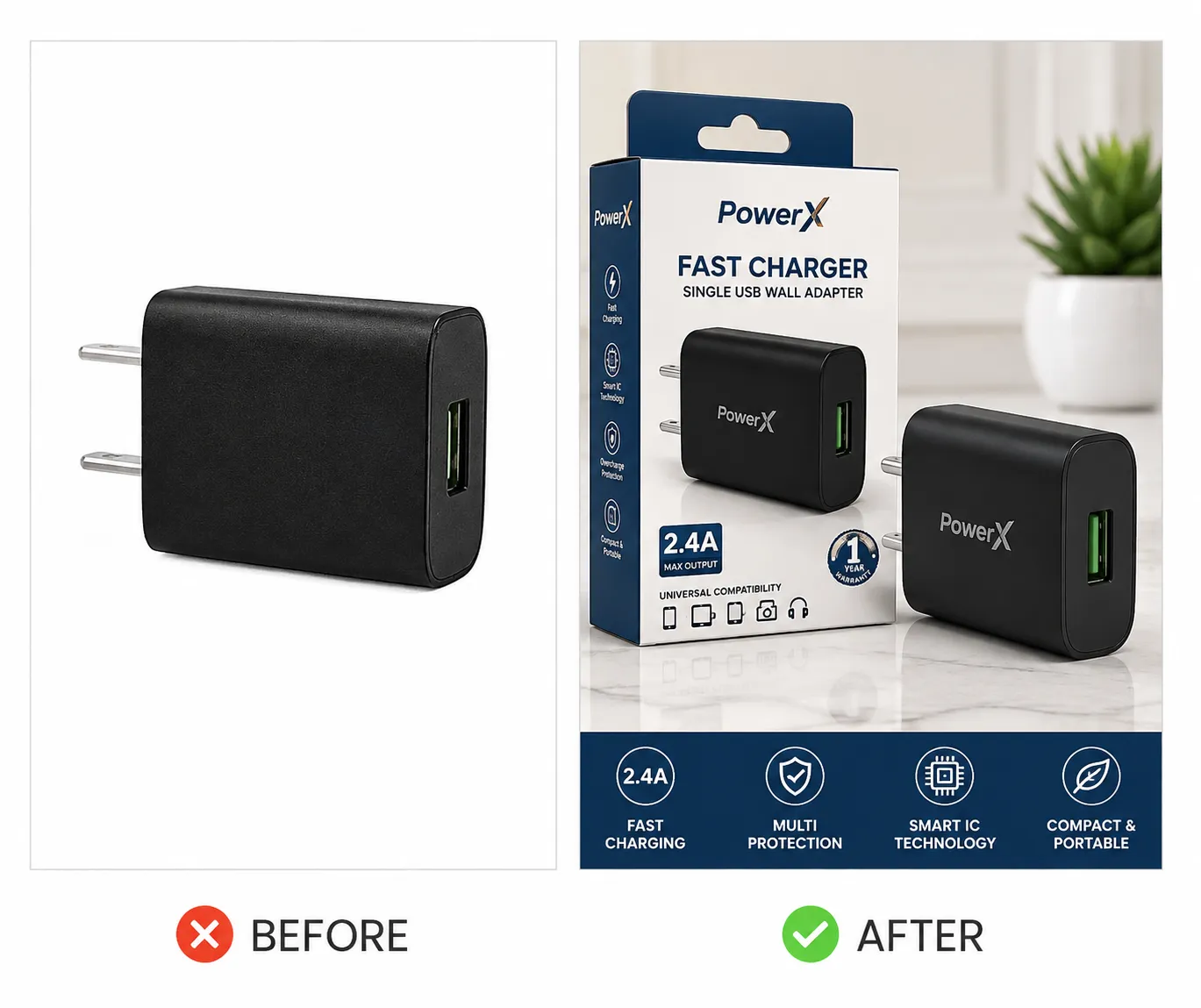
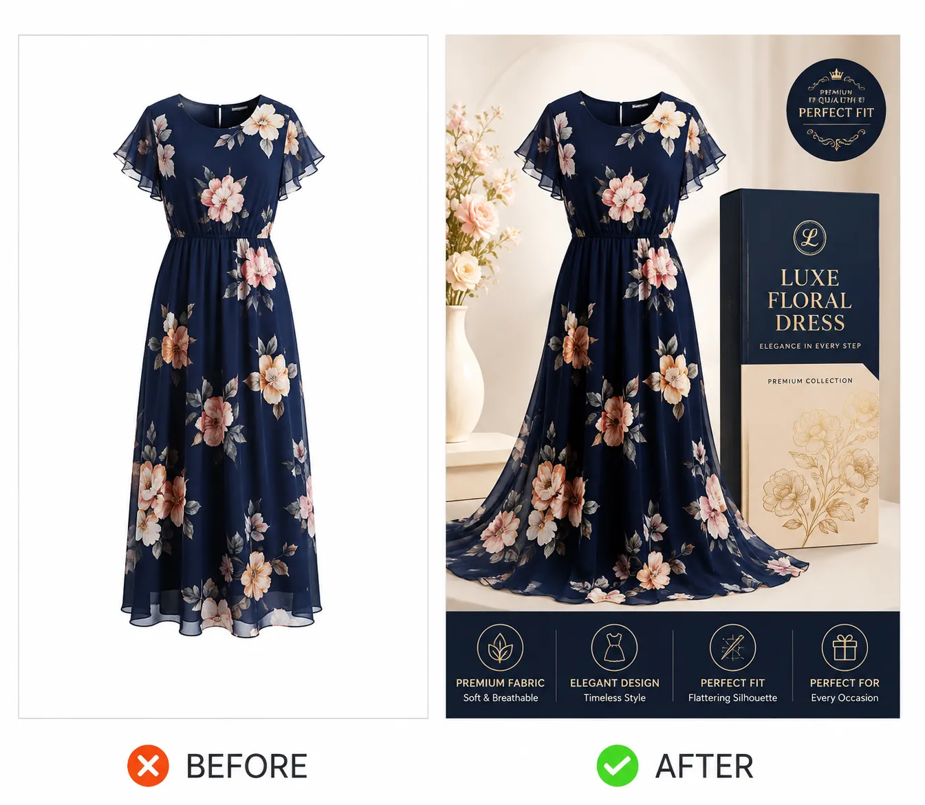
In competitive categories, test a new main image variation every 6–12 months; in less competitive categories, an annual review is typically sufficient unless the product itself is reformulated or repackaged. Once a winner is found, hold it in place for at least 90 days before testing again — Amazon’s ranking algorithm needs that window to reward the improved CTR signal with better organic placement, and swapping too frequently prevents that compounding benefit from ever fully materializing. Worth remembering: the image winning today can become next year’s category norm once competitors notice and copy it, which is why this is an ongoing discipline, not a one-time project.

Beyond the obvious (text, props, non-white background), the most common overlooked suppression trigger is a background that’s technically off-white rather than exact RGB 255,255,255 — a shade that looks correct to the eye but fails Amazon’s algorithmic check. Keeping a fully compliant backup main image ready allows a fast revert if a suppression does occur, rather than leaving the listing without a valid main image while a replacement gets produced from scratch.

The main image is intentionally the most constrained asset in the entire creative system — unlike Listing Images’ secondary slots, A+ Content, or the Storefront, it can’t draw on the brand’s full color palette or photography style beyond the product itself and its background. It should still feel consistent with the broader Brand Guidelines visual system where compliance allows (product styling, any swatch treatment for variations), but its primary job — winning the click — takes priority over broader brand expression, which the rest of the creative system is built to carry instead.

We pull the top 10–15 category listings and identify the shared visual pattern shoppers are already primed to expect.
We run the diagnostic framework to confirm a main image redesign is actually the right investment before designing anything.
Two to three genuinely distinct concepts get produced and checked against the full pre-upload QA checklist.
Concepts are tested via Manage Your Experiments or a controlled PPC split test for a minimum of two to four weeks, isolating CTR as the deciding metric.
A winner gets held in place for at least 90 days once found, with the next review scheduled on a 6–12 month cadence rather than left indefinitely.
For a brand-new listing with no historical CTR data, priority is a fully compliant, well-differentiated image built from the category competitive audit from day one, with an early testing cycle planned once enough traffic accumulates to generate meaningful data — rather than assuming the launch image is optimal indefinitely.
For an established listing whose main image hasn't been revisited in over a year, priority is re-running the competitive audit (category visual norms shift as competitors iterate) and testing a new variant against the current image, since a differentiation strategy that worked when it launched may have since become the new category default.
For a listing that's had its main image suppressed, priority is immediate diagnosis (which specific compliance element failed — background color, prop presence, fill percentage) and restoring a compliant image quickly using a backup or rapid correction, since every day without a valid main image is lost clicks and sales.
Your main image is the single biggest lever on click-through rate — before your title, your reviews, or your price ever get seen. Let’s optimize it against category benchmarks and Amazon’s compliance guidelines to stop the scroll and earn the click. Get in touch and we’ll show you what that looks like for your listings.
It's the first visual shoppers see in search results, sponsored ads, and category pages — shoppers process an image in as little as 13 milliseconds, and the main image's job is winning that split-second click before anything else on the listing gets a chance to matter.
A pure white background (exactly RGB 255,255,255), the product filling at least 85% of the frame, no text, logos, badges, or props, and a minimum resolution of 1,000px on the longest side (2,000px recommended to enable zoom).
No — Amazon's algorithm checks for exact RGB 255,255,255; off-white, cream, or light grey backgrounds can trigger suppression or reduced visibility even though they look nearly identical to true white.
Shrinking the image down to thumbnail size on a monitor to check whether it's still clear and compelling at the size most shoppers actually encounter it — a common, fast sanity check before finalizing a design.
A stronger main image increases click-through rate, which increases sessions and sales velocity, both of which Amazon's ranking algorithm reads as relevance signals — so a better main image can lift organic search position, not just immediate clicks.
Audit the top 10–15 listings for your main keyword, identify the visual pattern everyone follows, then deliberately break it — a different angle, a contrasting color against the white background, or a lifestyle cue no page-one competitor is using.
Yes — products with strong color contrast against the white background commonly pull higher CTR in crowded search result grids compared to products that blend into a similarly light or muted palette.
Compare sessions relative to ad spend against Unit Session Percentage: if sessions are low, the main image is likely the bottleneck (a CTR problem); if sessions are healthy but conversion is weak, the secondary image sequence or listing content is more likely the issue.
Design two to three genuinely different concepts (not minor variations of the same idea), then run a real test using Amazon's Manage Your Experiments tool (Brand Registry required) or a controlled PPC-driven split test if that's unavailable.
A minimum of two to four weeks, with some practitioners recommending 30+ days — shorter windows risk normal day-to-day variance being mistaken for a genuine performance difference.
Click-through rate — conversion rate matters too, but it's downstream of other factors like price and reviews, so CTR is the metric that specifically tells you whether the image itself is doing its job.
At least 90 days once a winner is found, to give Amazon's ranking algorithm time to reward the improved CTR signal with better organic placement before introducing another change.
Every 6–12 months in competitive categories; annual review is typically sufficient in less competitive categories, unless the product itself is reformulated or repackaged.
A built-in A/B testing feature for Brand Registered sellers that splits real search traffic between two main image versions, tracks impressions, clicks, and sales for each, and declares a statistically-informed winner.
Yes, using a controlled PPC-driven split test — running two ad campaigns with different main images against comparable traffic and comparing CTR — though Manage Your Experiments offers cleaner, native data when available.
Yes — keeping a fully compliant backup ready allows a fast revert if an image is suppressed or rejected, avoiding extended downtime on the listing's most important asset.
Flashing the image for one second and checking whether a viewer immediately understands what the product is — a quick proxy for how the image will perform in the split-second decision window of a real search result scroll.
Not as a direct ranking factor itself, but the CTR and sales velocity it drives are read as relevance signals by Amazon's ranking algorithm, creating an indirect but meaningful path to improved organic position.
Once a differentiated image starts winning, competitors often notice and copy the pattern — the image that wins this quarter can become the new category norm within a year, which is why ongoing iteration, not a single redesign, is the realistic long-term approach.
Yes — if a listing has color or pattern variations, the primary image's swatch should accurately reflect the specific variation, since a mismatch can hurt post-click conversion even if it doesn't affect the initial click.
JPEG format at 85–95% quality in sRGB color space is standard, balancing sharp image clarity with reasonable file size and load performance.
It can, particularly when every top competitor is using a straight front view — an angle showing more of the product's dimensionality or a genuinely differentiated framing can win attention specifically because it breaks the category's visual pattern.
Yes — since Sponsored Products and other ad formats display the same main image, a stronger image improves ad CTR as well, meaning the same creative investment pays off across both organic and paid placements.
If the image no longer reads clearly as a professional product photo at thumbnail size, differentiation can backfire — the goal is being instantly understood and instantly preferred, not different for its own sake.
Main image work typically takes priority, since it's what earns the click that gives secondary images and A+ Content any chance to do their job — but a genuinely broken secondary sequence shouldn't be neglected indefinitely while iterating on the main image alone.
Amazon's testing tools split traffic in a controlled way specifically to limit this risk, and a losing variant simply doesn't get published — the point of testing is avoiding a blind, permanent switch to an unproven image.
The compliance rules are universal, but differentiation tactics (angle, color contrast, what detail to lead with) should be benchmarked against that specific category's current competitive landscape rather than applied generically.
Compare its click-through rate against category benchmarks using Search Query Performance data, and run the shelf test and one-second identification test as quick qualitative checks alongside the quantitative data.
Compliance rules stay the same across marketplaces, but competitive benchmarking should be done per marketplace, since the category's top-10 visual pattern in the US may look meaningfully different from the UAE or India equivalent.
Typically a product photographer or 3D rendering specialist for the base image, informed by a category competitive audit, with final QA against Amazon's compliance checklist before any test goes live.